Last time we discussed how to highlight a row in Microsoft Excel automatically. This can be accessed here. Today we will discuss how to highlight a particular entry in a Microsoft Excel chart. The final result is shown in Figure 1.
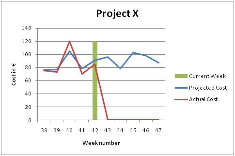
Figure 1 – Final result
To demonstrate how the above is achieved, we will use the following data:
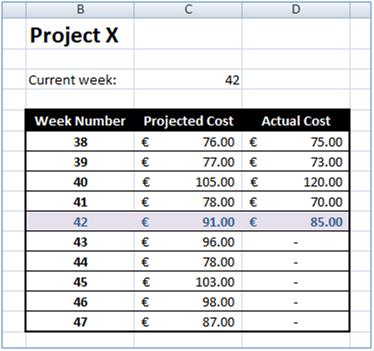
Figure 2 – Data
Step 1
The first step is to add a line graph for the data in columns C and D. The result should be similar to Figure 3. After adding the graph to the Excel worksheet, you can add a graph and axes titles.
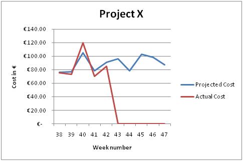
Figure 3 – Line graph showing our data
Step 2
To highlight the current week, we will make use of a column graph superimposed on the line graph. The values of the column graph will be all zeros except for the one showing the current week. To automate the process, we will make use of the ‘IF’ and ‘MAX’ functions. Figure 4 shows the data and the formula used. The ‘IF’ formula is used to compare the week number in row B with the one in cell C3 (the current week number). If the week number matches then we get the maximum value in the table, otherwise we set the value to 0.
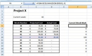
Figure 4 – Week mark data and formula
Step 3
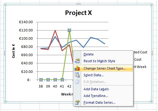
The last step is to add the newly created data in the graph. By default, the graph will be displayed like the other two – line graph style. Once the data is added to the graph, click on the newly added line graph and right click on it. Select ‘Change Series Chart Type…’ option from the menu (Figure 5). Select the ‘Clustered Column’ type from the ‘Change Chart Type’ dialog box and click the ‘OK’ button. This will produce the result shown in Figure 1.

